Top landing page tricks to boost your conversion
Category : On-page SEO
It’s important to remember that there is no such thing as a universally perfect landing page. The only universal “best practice” for maximising conversions is continuously testing and identifying what specifically works for your use case.
Which is why we don’t want to stick you with a stock standard list of supposed best practices – we’d prefer to get personal. Let’s dive into the specific tactics that will work for your landing pages and turn them into high-conversion machines.
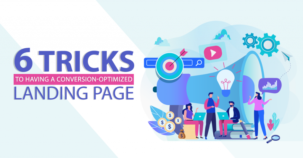
Here are the best tricks you should follow
1. Test, Test, Test – Start testing before you even start spending. Run your design up the flagpole with fivesecondtest.com and learn what users think, remember and do with your design. Then, once you’ve found a direction you’re comfortable with, put it to the test immediately. Start with A/B testing to try larger variations of design and copy, and fine-tune with multivariate testing of discreet elements.
2. Eliminate Options – Don’t create analysis paralysis for your visitors. Give users one choice, not three, not five. Multiple choices lead to confusion and confusion leads to … well, no where good. Eliminate choice and you make the conversion option easier to understand and easier to take action on. And less friction means more conversions.
3. Use Real, Happy People – Trust is huge in conversion, and people trust people. Putting a person’s face on your landing page can drive real results. 37Signals put people on their Highrise pages and increased conversion 102.5%, and plenty of other studies have been done about the impact of human faces on website conversion.
4. Use Social Proof – Logos, Likes, Pins – whatever it is, show the visitor that other people love your stuff. When visitors lack information they’ll turn to what others have done to help guide their decision. Reinforce the conversion with respected logos, testimonials and other points of social proof that help a visitor on the fence make the decision you want them to make.
5. Epic headlines – Most people abandon your landing page within 8 seconds, so your headline is often your one and only shot at convincing them to stick around. So be clear and concrete in what you’re offering and what they’ll get out of the deal. If you can’t summarize what the user will get from you in five words or less, keep iterating until you can. In most cases, cute or clever wording doesn’t convert. People won’t work that hard to figure out what you’re trying to say. Be specific, be brief, and be compelling.
6. Keep it above the fold – As designers, we hate the notion of boxing ourselves into the top 600 pixels of the design. But the fact is, people don’t scroll on a landing page unless they’re really, really intrigued. Don’t bury the good stuff, particularly main benefits and the call to action. Keep it up top and easy to digest in that initial eight-second look. If you go long, repeat the call to action near the bottom of your page to save the user the scroll back up.

best landing page tricks
Optimize the length of your landing page
There’s no shortage of arguments to support having short landing pages for maximum conversions. Websites like Qi Networks have boosted the conversion rate on their landing pages by 70% with shorter content.
On the other hand, there’s just as much evidence to support the opposite claim – that visitors are more likely to engage with landing pages that have more copy and detail.
Fact is, the optimal length for your landing page has less to do with industry trends and more to do with the stage of your business, the intention of the landing page and the behaviour of your users. Here are some key factors to consider when deciding on the length of your copy:
The function that your landing page serves
If your landing page exists to introduce new people to your product or service, it might be wise to have a longer and more informative landing page. People who are not familiar with your business generally require information in order to understand what you do and build trust.
On the other hand, if you run an established business or if you’re creating a landing page specifically for warm leads, you can most likely eliminate any copy that explains what your product does. Since these prospects have most likely encountered your business in the past, they don’t require as much information about your function in order to convert.
The cost of your offering
If your product is expensive or requires your prospects to invest a considerable amount of time or effort in order to convert, you’d be better off with longer copy. This is because your potential customers will require more information about the value of what you offer in order to make an investment of time or money.
Alternately, inexpensive products or services generally require less comprehensive copy as there is less thought involved for the user in the process of conversion.
How visitors are currently interacting with your landing page
Set up a heatmap and scrollmap for your landing page to collect data on how users are currently interacting with your landing pages. This will equip you with actionable analytics insights about how long visitors are spending on a page, how far down the page they travel before bouncing, the elements they’re interacting with the most and the ones they’re generally ignoring.
For example, if users are only reading the top 25% of your landing page before bouncing, it might indicate that your users have shorter attention spans and are finding your copy too long. You can probably afford to condense the length of your landing page to only highlight key features and benefits and keep users engaged to the very end.
Read more Onpage optimization techniques you should focus on
_______________________________________________________________________________
Please contact us for seo service packages at TDHSEO.COM.
TDHSEO Team
Email: tdhseo@gmail.com
Skype: tdhseo
https://www.facebook.com/tdhseo
Thank you!